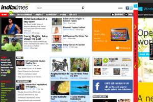
If I land up on one ( Mashable, Yahoo, TheVerge, Reuters, … ) It’s humanly impossible to sort out information on these pages. I can’t decide which column to start from and which order to go in, to make sure I don’t miss anything Interesting.

Death of Design
The pages looks colorful with lot of pictures and good typefaces scattered, typically resembling some Red Light District stores, just begging and luring you to get in.
This defeats the purpose of technology, which was to scale down the time taken to make choices. Inundating information on the face of the reader might stun the poor guy but it is ultimately worthless. User time on site shoots up (which makes webmasters happy) but conversion rates droop down because the selection process consumes lot of brain power, something that people hate.
If you are still wondering why these websites get lot of traffic then you need to look at their sources. Its either Google or Links posted on Facebook, Twitter and other social mediums. The sources are hyper focused on one piece of content which sounds sensible. So why not adopt it and change the damn homepages? It’s not about the feel the site gives but more importantly, about the process of discovering interesting information. Organization is the key.


Agreed with your point! Websites you’ve mentioned are oceans of ‘breaking’ news and other information. Only exception among these giants is Google, maintaining subtle design everywhere.
And for your screenshot, not only it’s death of design but of news too 😛
Hi there!
You Need Leads, Sales, Conversions, Traffic for etiole.com ?
I Will Findet…
Don’t believe me? Since you’re reading this message then you’re living proof that contact form advertising works!
We can send your ad to people via their Website Contact Form.
I WILL SEND 5 MILLION MESSAGES VIA WEBSITE CONTACT FORM
IF YOU ARE INTERESTED, Contact us => [email protected]
Regards,
Quirk